Designing Dashboards with ISO 22400 KPIs: Examples and Patterns
A practical guide to designing role-based manufacturing dashboards using ISO 22400 KPI concepts for operators, engineers, and plant leaders in aerospace environments.


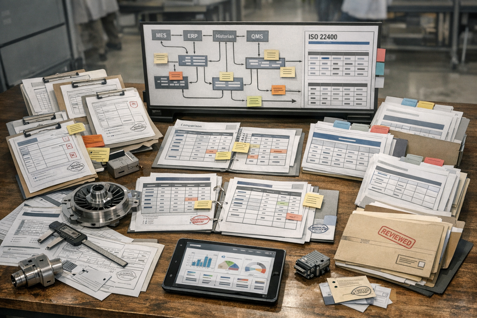
ISO 22400 can improve dashboard design by giving manufacturing teams a consistent way to name, group, and describe performance indicators. In aerospace manufacturing, that consistency matters because operators, manufacturing engineers, quality teams, and plant management often look at the same production system from very different decision horizons. A well-designed ISO 22400 KPI definitions used in dashboards approach helps each role see the right metrics without changing what those metrics mean.
This article is for aerospace operations, quality, and compliance teams who need to understand Designing Dashboards with ISO 22400 KPIs: Examples and Patterns. It explains the practical question this topic answers in a manufacturing execution context.
This is especially useful in regulated environments where production visibility, traceability, and comparability across lines or sites must be defensible. ISO 22400 does not prescribe dashboard layouts, color schemes, or chart types. What it does provide is a reference model for KPI meaning, time behavior, units, and user context. That makes it a strong foundation for tool-agnostic dashboard design in MES, BI, historian, and operations reporting systems.
For teams putting this topic into daily operation, ISO 22400 KPI governance help connect the concept to traceability, work-order reality, and audit-ready evidence.
For teams putting this topic into daily operation, a connected execution platform, Connect 981’s aerospace execution solutions, real aerospace execution examples help connect the concept to traceability, work-order reality, and audit-ready evidence.
The same operating model also depends on Connect 981’s aerospace operations guidance, practical aerospace operations FAQs, ISO 22400 KPI governance, especially when decisions have to move across quality, production, suppliers, and program leadership without losing context.
The examples below are illustrative design patterns, not requirements of the standard. The goal is to show how aerospace manufacturers can build clearer dashboards for operators, engineers, and managers while keeping KPI labels and interpretations aligned.
Why Standardized KPI Definitions Matter for Dashboards
Reducing confusion over similar-looking metrics
Many dashboard problems start with metrics that appear similar but are defined differently across systems. One screen may show uptime, another availability, and a third utilization, even though users assume they mean the same thing. In practice, those values may rely on different state models, time exclusions, or quantity assumptions.
Using ISO 22400 as a reference reduces that ambiguity. If a dashboard presents a KPI with a standard-aligned name, description, and unit, the user has a better chance of understanding what is included, what is excluded, and how to compare it with another view.
Making cross-plant dashboards reliable and comparable
Aerospace manufacturers often need to compare performance across cells, programs, suppliers, or sites. Those comparisons are only useful when the KPI definitions are stable. A plant-level dashboard that aggregates work center data from multiple facilities can become misleading if each facility classifies states or labels losses differently.
Standardized definitions create a shared reporting baseline. That is particularly important for enterprise manufacturing teams trying to understand whether variation reflects actual operational differences or only reporting inconsistencies.
Using ISO 22400 as a reference for labels and descriptions
Even when an organization uses custom calculations or aerospace-specific supplemental metrics, ISO 22400 can still guide the descriptive layer of the dashboard. KPI names, tooltips, metadata panels, and data dictionaries can reference standardized concepts so users know whether a metric is equipment-oriented, order-oriented, time-based, or quantity-based.
This improves handoffs between operations, industrial engineering, and compliance teams. It also supports cleaner integration between MES, ERP, QMS, and site reporting tools.
Design Principles for ISO 22400-Aligned Dashboards
Clear naming and tooltips with standardized definitions
The first principle is simple: every KPI tile, chart, or table should use explicit naming. Avoid abbreviations unless the user group is already trained on them. Where possible, include a hover tooltip or details panel that explains the KPI definition, unit of measure, aggregation level, and reporting period.
For example, a dashboard should not just show a value labeled performance. It should indicate whether that is an equipment-oriented KPI, what time basis it uses, and whether it applies to a work unit, production line, or plant summary. In regulated aerospace environments, this level of clarity also helps when metrics are reviewed during audits, quality investigations, or supplier performance discussions.
Consistent units, ranges, and trend directions
Users should not have to guess whether higher is better, whether a metric is expressed as a percentage or absolute duration, or whether a chart compares hours, parts, or orders. ISO 22400 concepts support more disciplined KPI presentation by encouraging consistent attributes around units and trend interpretation.
In practice, this means dashboards should standardize how percentages are displayed, how durations are rounded, and how red-yellow-green logic is applied. If one KPI improves when it rises and another improves when it falls, the trend indicators should make that explicit rather than relying on user memory.
Clarify the operational risk
When the work behind Designing Dashboards with ISO 22400 affects quality, delivery, or compliance, teams need one place to connect evidence, decisions, and shop-floor follow-through.
Separating real-time views from aggregated performance views
One common design mistake is mixing live operational status with shift, weekly, or monthly performance in the same visual block. Real-time equipment states answer immediate execution questions. Aggregated KPIs answer performance review questions. They should support one another, but they should not be confused.
A useful pattern is to separate dashboards into at least two layers: a live operating view and a summarized performance view. The live layer can show current state, alerts, and active disruptions. The summary layer can show trends, comparisons, and loss structures over a completed period. This keeps decision-making aligned with the actual time horizon.
Dashboards for Operators and Shift Supervisors
Focusing on equipment states and immediate KPIs
Operator-facing dashboards should emphasize what requires action now. In an aerospace machining, assembly, or test environment, this usually means current equipment state, order status, queue condition, and short-horizon KPIs tied to immediate execution. The user should be able to identify whether a station is running, idle, stopped, or producing below expected pace without opening a second report.
A practical layout is a top row of state tiles by work unit, followed by a small set of shift KPIs such as good quantity, stop duration, schedule adherence, or quality exceptions. The screen should privilege speed of interpretation over analytical depth.
Visual cues for downtime, speed loss, and quality issues
Supervisors benefit from cues that distinguish different loss types instead of combining them into one generic exception state. A downtime banner can separate planned from unplanned events. A speed-loss indicator can show when a process is running but below expected output. A quality panel can flag held units, inspection failures, or rework events requiring immediate coordination with quality personnel.
These cues are especially valuable in aerospace production, where nonconformance response and material segregation may be just as important as throughput. The dashboard should help the team see where flow is disrupted without oversimplifying the operational context.
Using state-based indicators aligned with ISO 22400
ISO 22400 concepts are helpful here because operator dashboards often depend on state classifications more than on high-level rolled-up metrics. If the dashboard consistently maps RUN, STOP, IDLE, or similar state categories into defined time structures, users can trust that the shift summary is based on the same logic as the real-time display.
An example pattern is a left-side live state panel, a center shift timeline of state transitions, and a right-side exception list tied to open orders or quality events. This works well in control rooms, supervisor stations, and digital production boards.
Dashboards for Engineers and Continuous Improvement Teams
Deeper breakdowns of time and quantity categories
Engineering and continuous improvement users need more than live status. They need to understand how KPI values were formed. That means dashboards for these roles should support breakdown analysis across time categories, quantity categories, equipment groups, and product families.
A good engineering dashboard typically starts with a summary KPI layer, then offers drill-downs into the time model behind those KPIs. For example, a team reviewing a composite layup area or precision assembly line may want to trace reduced performance to waiting time, setup patterns, recurring micro-stops, or inspection bottlenecks.
Correlations among related ISO 22400 KPIs
ISO 22400 KPIs should not be treated as isolated numbers. Many are related through common time and quantity structures, so dashboard design should make those relationships visible. If one KPI deteriorates, users should be able to see adjacent indicators that explain whether the issue is state-related, quality-related, or order-related.
A useful pattern is a dashboard that pairs trend charts with decomposition views. For example, a weekly equipment effectiveness trend can sit above a stacked time-loss chart and a quality yield panel. This allows engineers to evaluate whether changes are driven by downtime concentration, reduced operating performance, or rising defect activity.
Identifying patterns across lines and work centers
For multi-line or multi-cell aerospace operations, engineering teams often need comparison views. Heat maps, ranked tables, and small-multiple trend charts are effective when the underlying KPI definitions are consistent. The point is not just to identify the worst area, but to determine whether a recurring pattern exists across similar work centers, programs, or shifts.
Where traceability is important, dashboards can also connect summarized KPI deviations to contextual data such as part family, route step, tooling set, or supplier lot category. That does not change the ISO 22400 KPI itself, but it gives engineers operational context for investigation.
Dashboards for Plant and Enterprise Management
Aggregated ISO 22400 KPIs across areas and sites
Management dashboards should summarize performance at the level required for planning, review, and escalation. Plant leaders rarely need second-by-second state detail, but they do need confidence that aggregated values are comparable across areas. This is where ISO 22400-aligned definitions are particularly useful.
Connect decisions to execution
Connect 981 helps turn this kind of operational detail into traceable action, so the context behind each decision does not get lost.
Discuss the workflow for Designing Dashboards with ISO 22400
A plant dashboard may organize KPIs by area, value stream, or program, with weekly and monthly trend windows. An enterprise dashboard may compare sites while preserving the same KPI meaning across all sources. This supports more defensible reviews and reduces arguments over local naming conventions.
Benchmarking plants and suppliers on common definitions
In aerospace supply chains, internal plants and external suppliers may report similar production outcomes using different tools. Benchmarking becomes more reliable when dashboards reference common KPI semantics. If supplier review packs and internal site scorecards use aligned definitions, management can compare performance without extensive manual translation.
This does not mean every supplier dashboard must look the same. It means the underlying KPI descriptions, aggregation rules, and units should be harmonized enough to support fair interpretation.
Blending standardized KPIs with financial indicators
Management dashboards often combine operational KPIs with business indicators such as cost of nonconformance, labor efficiency, schedule risk, or inventory exposure. That is appropriate, as long as the dashboard makes a clear distinction between ISO 22400-aligned manufacturing KPIs and organization-specific financial measures.
A simple design rule is to visually separate standardized operational metrics from financial or strategic overlays. This preserves clarity and prevents users from assuming that every number on the page is governed by the same standard reference.
Implementation Tips Across BI and Operations Tools
Using a platform like Connect 981 as a single KPI source
Many manufacturers struggle because KPI logic is duplicated across MES screens, spreadsheet reports, data warehouse models, and executive dashboards. A better pattern is to maintain a governed KPI layer in a platform like Connect 981, then expose the same definitions into different tools depending on user need.
That approach helps aerospace manufacturers maintain consistency across production visibility boards, engineering analysis tools, and management scorecards. It also improves traceability when a KPI definition changes or a data source is reclassified.
Maintaining definition consistency across tools
Consistency requires more than a common metric name. Teams should maintain metadata for each KPI including description, unit, aggregation logic, object of measurement, and intended user group. Tooltips, data catalogs, and dashboard footnotes should all draw from that same governed source.
If a BI tool uses one label while the MES uses another, users will create their own interpretations. That is exactly the drift ISO 22400 can help avoid when applied as a reference model.
Periodic reviews to prevent KPI drift and clutter
Dashboards should be reviewed on a regular cadence. Over time, organizations add metrics, duplicate existing indicators, or keep outdated views alive after process changes. The result is clutter, inconsistent definitions, and declining user trust.
A periodic review should check whether each KPI still has a clear owner, whether the definition remains aligned with the current production model, and whether each user group still needs the metric on its main screen. For aerospace and defense manufacturing, these reviews are also a good point to verify that KPI displays still match current process controls, quality workflows, and reporting obligations.
When dashboard design follows role-based decision needs and references ISO 22400 for KPI meaning, the result is not a generic report library. It is a structured operating view that helps people at different levels see the same manufacturing system with less ambiguity and better context.


Related Blog
Related FAQ
Built for Speed, Trusted by Experts
Whether you're managing 1 site or 100, Connect 981 adapts to your environment and scales with your needs—without the complexity of traditional systems.
