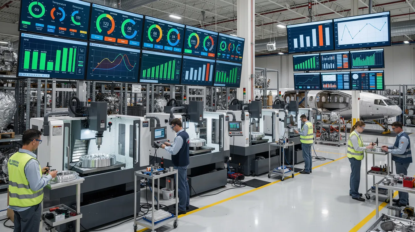
No. ISO 22400 does not prescribe specific dashboard layouts, chart types, colors, or interaction patterns for KPI visualization.
ISO 22400 defines a common language and structure for manufacturing performance indicators, especially for areas like OEE, availability, performance, and quality. In particular it focuses on:
In practice, this connects to ISO 22400 KPI governance when teams need to turn the answer into repeatable execution habits.
The standard is primarily about what to measure and how to calculate or categorize it, not how it must be rendered on screen.
Because ISO 22400 does not fix the presentation layer, each organization must make design and validation decisions around:
In regulated environments, these design decisions typically require documented requirements, change control, and, where applicable, validation or qualification. ISO 22400 does not remove that burden and does not guarantee that any specific visualization is appropriate for your process, safety profile, or regulatory regime.
In brownfield environments, you are unlikely to replace all existing dashboards simply to align with ISO 22400. More common approaches include:
Full replacement of established dashboards solely for visual standardization often fails in aerospace- or pharma-grade contexts due to validation cost, risk of misinterpretation during transition, limited downtime for deployment, and the complexity of requalifying user training and work instructions. ISO 22400 can guide KPI semantics without forcing a wholesale UI replacement.
In practice, organizations tend to use ISO 22400 to:
The visual design itself is then driven by safety, usability, site conventions, and tool limitations, and must be validated within each plant’s quality system where required.


Whether you're managing 1 site or 100, Connect 981 adapts to your environment and scales with your needs—without the complexity of traditional systems.


Whether you're managing 1 site or 100, C-981 adapts to your environment and scales with your needs—without the complexity of traditional systems.